Friday 25 September 2015

Unit 310 - Photo Image Output

Statement of Intent:


My aim is to produce 20 final images in relation to my chosen themes. I will demonstrate understanding and use of materials and techniques used in order to produce and present my final work. Workflow will be evidenced from camera set up through to printing methods.
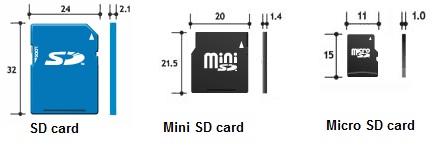

Card Types

SD cards are the most commonly used for DSLRs, whereas the similar Compact Flash cards are a less frequent form of digital storage, however they both serve the same purpose and do not affect image quality. Cameras typically use one or the other, or even a Micro/Mini SD or XD card; the physical size of the card does not affect its storage capacity, with cards up to 64GB or larger available (5000 RAW files or upwards of 30,000 JPEGs). 

SD card speeds are classed as 2, 4, 6 & 10MB/sec, or factors such as 100x, 200x, etc., indicating how many times faster than a standard CD-ROM drive it is at reading information.

2 - Fast enough for standard definition video recording

4 - Full HD (if bit rate allows)

6 - Full HD

10 - Allows photographs to be shot in fast succession, you don't need to wait around for files to be stored (2 could take up to 10 seconds to record an image)


SD


Compact Flash


 XD


Formatting a Card


A new card should be formatted in the camera in which it will be used, the reason for this is that the images taken on this card can then be traced back to the photographer's camera. Formatting can also prevent the future corruption of files, as any memory space that doesn't act as it should during this process will be blocked out. When formatting a previously used card, the difference between formatting and deleting files is that formatting completely wipes the card's memory, including files you cannot see.


Basic Camera Setup


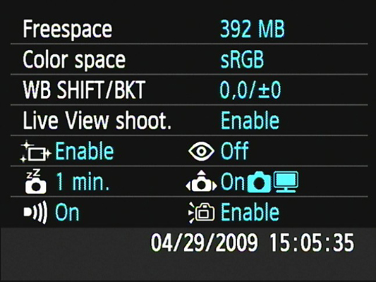
Date & Time - This can be changed by pressing a Canon's MENU button. It is important to regularly check that this information is accurate, as this is embedded in your image file and can be called upon if ever a photo is subject to copyright issues.

Freespace - The available space remaining on the card.

Live View Shoot - Allows you to view through the camera's screen rather than the sensor.

Colour Space -  Tells you whether you are shooting in sRGB colour or Adobe RGB colour profile. Adobe RGB is typically used to print images, printing in sRGB will give a slightly different result.


The image above represents the difference between sRGB and AdobeRGB. While both images contain 3 colours, the depth and range amid the colours in AdobeRGB are greater than those of sRGB. In the case of photographing bold and vibrant colours, sRGB may be used to balance them out, whereas AdobeRGB could be selected to enhance this. The Colour Space would ideally be selected in-camera, but can be changed in post-production, with some limitation.


Image Quality


Lens quality, camera settings and image sensor quality can all affect the quality of the final image. Resolution matters particularly when printing photos, as images on the internet are generally no larger than 72ppi because hi-res files can make pages load slowly. 

Large prints require higher resolution than small ones. However, printing a hi-res photo in a smaller size won't affect its quality, whereas the adverse will.


File Formats


JPEG - Joint Photographic Experts Group (named after those who created the standard); file extension .jpg or .jpeg. Maximum image size of 65,535x65,535 pixels and defines how an image is decompressed into bytes and then recompressed back into an image. JPEGs that undergo multiple edits will have a reduced image quality each time.

GIF - Graphics Interchange Format, 8 bits per pixel per image; can be used for small animations and low resolution film clips. Palette limitations make this format unsuitable for reproducing colour photos - more suited to files with areas of solid colour.

BMP - Bitmap image file. Stores colour data for each pixel without compression, eg. a 10x10 pixel image will contain colour data for 100 pixels. Often used for printed images, high-quality, but large file sizes.

TIFF - Tagged Image File Format. Used for publishing, 3-D imaging and medical imagery. Can have a bit depth of either 8 or 16-bits per channel. Multi layered images can be stored as one TIFF file - some cameras have the option to save images as TIFFs when taken.

PSD - Photoshop Document. Can save multiple layers as one file, similar to a TIFF; when opening a .psd file, the individual layers are still accessible and can be edited again, even after saving.

TGA- Truevision Graphics Adapter, can store image data with 8, 15, 16, 24 or 32 bits of precision per pixel. Used for professional photo and video editing, with its intended output as standard television screens.

PNG - Portable Network Graphics, in time, is expected to replace the GIF format as it can be up to 30% more compressed, although PNG cannot support animation or contain multiple images. Images can be saved in true colour; has the ability to control gamma correction and allows colour opacity to be altered.


JPEG files have lossy compression, meaning when edited and saved, some information is lost in order to reduce the file size. Depending on the original file size and resolution, this may or may not be noticeable to the viewer. RAW, TIFF and PSD files on the other hand, are lossless as they preserve all of the original file's data. RAW files are recorded straight from the camera's sensor, giving the purest image. Saving a low-quality 'lossy' file can create problems such as the visibility of 'compression artefacts'; pixelation and a lack of definition between lines and colours.

All of my images will be shot in both RAW and JPEG for the purpose of editing and transporting files.

"The raw capture gets everything your camera's sensor can see. A JPEG is also a raw capture...but the resulting image has been modified or processed by the camera's analog-to-digital conversion and the camera has 'baked in' some critics attributes such as bit depth, colour space, tone mapping, and white balance. If the raw capture is the cookie dough, then a JPEG is a baked cookie."

- Jeff Schewe, The Digital Negative, p.27


ISO


When using studio lighting, it is important to shoot at the lowest possible ISO setting (100) in order to give the best quality image. A lower ISO means the sensor is less sensitive to the light and therefore eliminates unwanted grain. Shooting at a high ISO (1600 - 64000) can make a photograph noisy, but may be necessary under low-light conditions. 

The following shots by New York photographer James Maher illustrate how ISO can be used in low light:


1/250, f9, ISO 1600 - Slight grain, but not so much that it detracts from the shot


1/125, f2, ISO 64000 - Grain present, but pleasing to look at


PPI & DPI


PPI is used to adjust the physical size, not the resolution of the eventual print. Decreasing the PPI and increasing the print size will produce a lower quality image as the pixels will become more visible. On extremely large prints like billboards, the image will appear to be of a good quality from the distance at which we would normally view it, however on close inspection, the pixelation will be obvious. 
DPI is a technical aspect of individual printers, as is the pixel resolution of a monitor screen. Higher DPI does not necessarily make for a higher quality print, as there is no regulation dot size or shape. This proves troublesome as it could mean that one printing company producing an image at 1200dpi may not look as good as another printer's image at 700dpi.


Potential Printing Issues


Prints too light, or have marks or lines on them - This could mean a clogged print head. If the printer is not used regularly, the ink may dry up. Try printing a test page first.

Prints not high enough quality - For a good quality print, the minimum pixel count should be 200ppi (meaning a print of 4x6 = 800 x 1200 pixels). A low quality print will appear pixelated, lacking in detail and may look out of focus as a result. 

Wrong paper setting selected - When preparing to print, make sure the correct paper type is chosen (matte, gloss, etc.); the paper type determines how the printer lays down ink. If the ink is not laid correctly, the page may not dry and the inks may appear a different colour to that which you were expecting. 

Low-quality paper -  Cheaper brands of paper don't tend to render colours as well as higher-priced, better quality brands. This could also result in ink colours being incorrect. Ideally, paper of the printer's manufacturer should be used, as these are designed specifically for how that printer works.


Preparing an Item to Print


  • Calibrate your monitor to make sure the colours you are seeing are 'true'.
  • Set colour profile (AdobeRGB)
  • Resize image correctly - no  less than 200ppi, ideally 300ppi. What size is it cropped to?
  • Does the image need a border added?


Print Production Workflow

Click to enlarge


Legal and Ethical Conditions

Copyright - The right to make and distribute copies, display the work publicly, alter the work, or sell it to someone else. The artist owns copyright from the moment the image is taken. Copyright expires after the artist's life plus 70 years.

Infringement - Unauthorised use of someone else's work.

Model Release - A form outlining terms under which the artist may use an image of the model; should ideally be issued before or during the shoot.

Right of Privacy - Use of a person's identity to advertise without their consent; public disclosure of information concerning an individual which may be detrimental to their reputation; publication of false and offensive information about an individual.

Plagiarism - Claiming someone else's work or ideas as your own.

Image Protection - Images can be protected by the original file metadata and a watermark if it is being used in public domain.

If the original photographer cannot be found after extensive research, legal judgment can class it as an 'Orphan Work', leaving it open to become property of the party requesting to use it.

Any photo manipulation must remain ethical, or it will violate the model's Right of Privacy.
One example is Time Magazine's portrayal of O.J. Simpson; his skin is made to look darker than it is in reality, he is also surrounded by dramatic vignetting, giving him the appearance of a textbook villain. This is unethical as it is detrimental to his character representation.


Another example is models for fashion or gossip editorials being slimmed and airbrushed without their consent. This may be offensive to the individual, while portraying an unachievable body image to the audience. 


Printing Techniques


Medium Quality

Lithography - Can potentially provide good detail, however runs the risk of poor colour quality and a lack of contrast. An image is etched on to a roller, then coated in ink (positive image); another roller is coated in water (negative image). Therefore, the ink sticks to the areas not containing water, while the water 'cleans' the image. An example of lithographic printing is newspaper print.

High Quality

Rotogravure - Very high resolution, expensive etched plates. Pits were etched by hand, with the depth of each pit reflecting the density of colour it would produce. Similarly to newsprint, each colour would have a different press.

GlicĂ©e - Inkjet printing, which takes the digital information directly to print. High-end printers will often have 8 or more inks.

Laser Printing - Lasers etch an electrostatic roller, passing through the inks directly to the paper.

Print Finish


Inkjet - Low absorbency; hold detail well

Canvas - High absorbency; lack of detail & contrast

Cheap print paper  - Prone to smudging, lacks tonal range

Glossy - High-contrast, can make images appear very sharp. Does show up scratches and fingerprints very obviously, reflectivity can make images difficult to view in certain lights

Matte - Don't appear as sharp as gloss prints, however easier to view in all lights. 'Classic' finish.

Lustre - Middle ground - high-contrast but not distractingly reflective. Less prone to finger prints.


Health & Safety


Printing Risk Assessment

Click to enlarge


Photoshop Revision : Layer Masks


Layer masks are a non-destructive method of adding and removing layers and controlling their transparency.

Black on the layer = invisible
White on the layer = visible

  • On existing image, create a new layer
  • Marquee a shape & fill with colour
  • Move this layer above the original image
  • Create layer mask (black to erase, white will always bring it back - non-destructive, unlike eraser tool)

  • Shift & delete = fill
  • Alt & click layer mask = preview
  • Command & click = select layer mask
  • Shift & click = temporarily disable layer mask
  • Backslash = quick view of layer mask
  • Command & I = insert layer mask

  • Select background with magic wand
  • Add layer mask
  • Invert so background invisible, subject layer visible
  • New fill layer - solid colour (any apart from black or white)
  • Drag colour layer under subject
  • Double click fill layer to change colour if necessary

  • Add layer mask to fill layer
  • Make a marquee selection (or series of)
  • Shift & delete = fill with black
  • Adjustment layer, solid colour
  • Drag this below background layer & subject layer

  • Command & G = group layers (can now turn all off/on simultaneously) 

  • Alt, click & drag = duplicate layer mask from one layer to another
  • Drag layer slightly to one side for shadow/echo/stagger effect
  • Add layer mask to group
  • G = gradient
  • Linear gradient
  • Foreground to transparent
  • Drag from left to right
  • Coloured layer mask is now fading from invisible to visible
  • Put colour adjustment layer behind this for colour gradient effect

Screen Calibration


The colours in our computer monitors can drift slightly over time. For this reason, it is important to calibrate them regularly, meaning making sure the colours are true to life.

We cannot trust our own eyes to judge whether the colours are truly accurate - we may see colours slightly differently to those around us. Calibration assures the results are standardised. When printing images, the colours will differ from what we see on screen if either the printer or computer screen aren't calibrated.

There are various calibration devices which you can buy, including those from Spyder, X-Rite and Wacom - these measure the colours emitted by the monitor. On connecting to your computer, the software will flash colour patches on screen for the device to measure. The device is able to measure the value of the colours displayed on screen with the values of true to life colours. It will then create a colour profile to compensate for any irregularities, saved on your hard drive and automatically used to correct the screen's colours.


Image courtesy of bhphotovideo.com


Test Printing


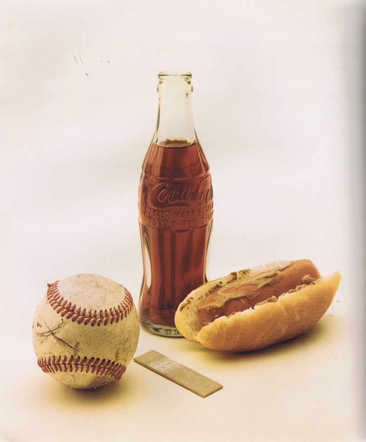
It is important to regularly test printers and inks by printing trusted test images. For example, my workplace use Kodak test images after replacing ink cartridges or if the printer hasn't been used for some time. 

Test prints are designed to have checks that the printer needs to satisfy, for example:


The photo above is to check the saturation. We know that the foods in the image should be vibrant in colour, does the print match this?
The bar along the side also shows gradients of magenta, blue, cyan, red, yellow and green. Are all of the shades visible on the print? Is there definition between them?


The shot on the left shows magenta skin tones, whereas that on the right demonstrates yellow skin tones. Common problems with this can include magentas printing too red or subtle yellow tones appearing dull and blue. 


The contrast between extreme highlights and shadows must also be accounted for. Is the lit side of the shirt white? Are the shadows still allowing detail in the face?


Printing Set-Up


Here I have set up one of my images to print. Earlier, I tested a high quality paper against a cheaper high-street paper. The colour did not take to the cheaper paper very well, leaving weaker shadows and an overall yellow hue. 


I have used both the basic and advanced settings - in basic I have set the colour mode to Adobe RGB and the output resolution to the maximum this printer can achieve to ensure high quality prints.


In the advanced settings, I have reduced the magenta by 5. Printers often have their own individual 'quirks' due to set up or servicing; I have been informed that this printer tends to drift towards magenta, so this is taken into account. 

Due to the screen I have been working on and the screen I have printed from being uncalibrated - my first print came out very blue and cold. To counteract this, I added in some yellow and red and re-printed. The results were noticeably better the second time round. To prevent this in the future, I will calibrate my screen.


Final Images Produced:

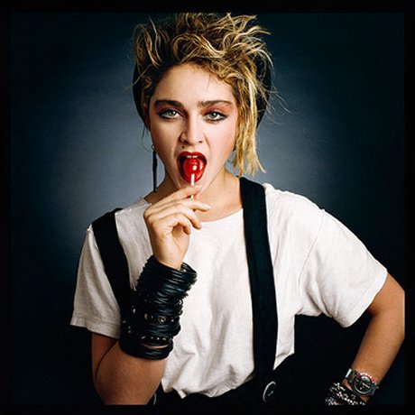
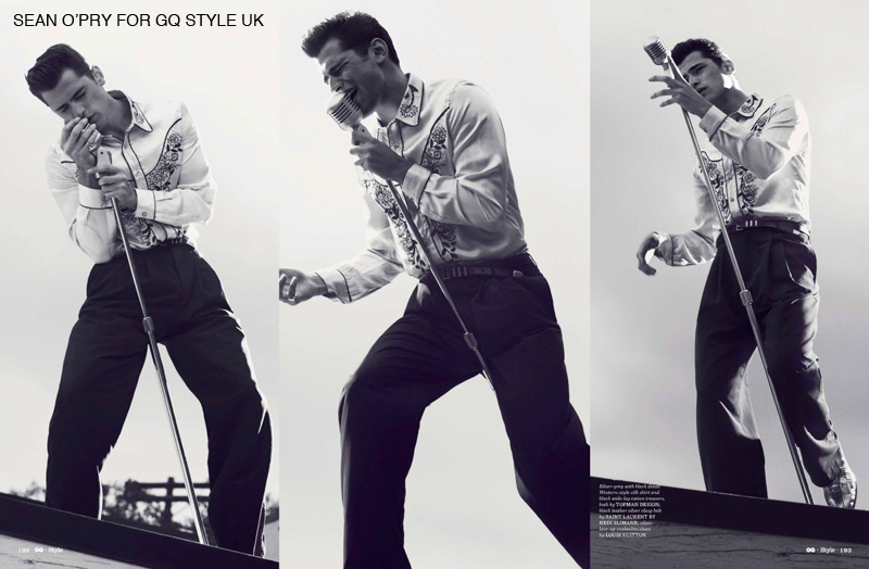
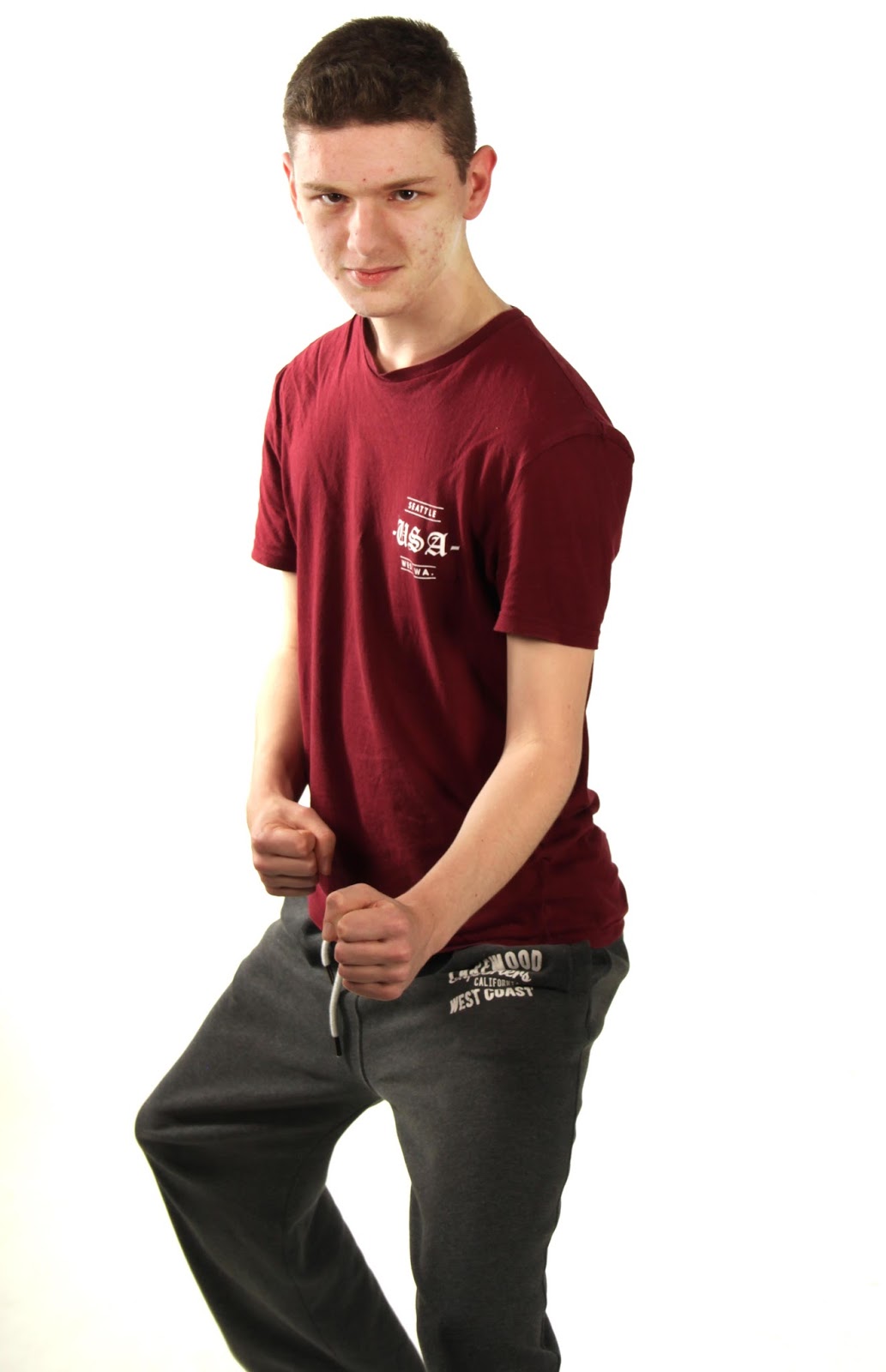
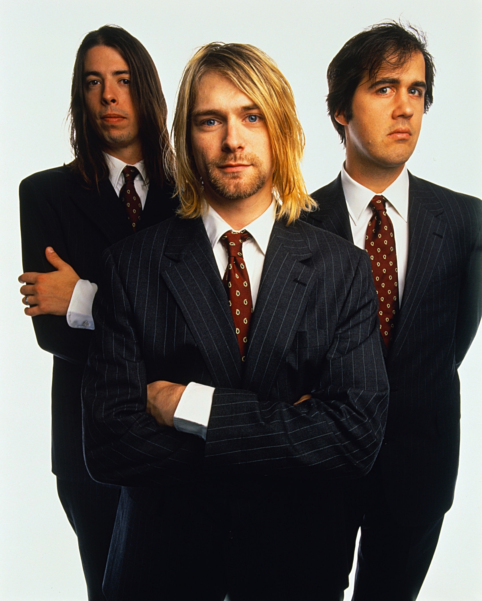
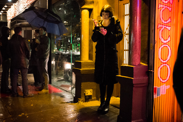
Theme 1: Portraiture


Theme 2: Still Life


Evaluation


 By following the correct procedure from the early stages of camera set-up (formatting SD card, setting colour profile, shooting in both JPEG and RAW, etc.) through to preparing images appropriate for print, I feel I have produced two successful series of photographs representative of myself as a creator. Alongside technical knowledge, I feel I have displayed a certain amount of personal flair, humour and both genre and cultural awareness. Additionally, I have also taken into account factors of consent and ethical consideration in terms of the representation of imdividuals. If I was to undertake this project in hindsight, I would like to learn more about colour balancing and the grading process of image production.

Unit 306 - Studio Photography


Portraiture Lighting


In portraiture, studio lighting can be moved and manipulated in order to create a certain mood and atmosphere within the image. For example, chiaroscuro lighting (from one side, leaving the other side in shadow) can add a sense of mystery and drama, as in the top two images. The harsh shadows emphasise certain facial features and angles, casting interesting shapes over the face. Various diffusers, filters and fittings have been manufactured in accordance to how the light is wanted to fall. These include snoots, soft boxes, reflectors and coloured gels - each, or a combination of several can make a difference when establishing the mood, message and connotations of a shot.

Iconic portraits of female stars of the 40s & 50s were conventionally lit around the eyes, with occasional backlighting of the hair, as seen in images of Marilyn Monroe. They were also sometimes lit with a halo of light circling their head, adding to the perfect, angelic qualities these women were assigned.

Lighting can also be used to highlight and even isolate key areas through the use of diffusers, snoots and filters. This can be used to create a sense of sensitivity and solemnity and give high contrast as opposed to a more subtle range of tones.
From an advertising point of view, make up adverts will strive to make bold colours appear as vibrant as possible by use of high-key lighting, although some hoping to achieve a more 'natural' look may incorporate softboxes and diffusers to give a softer finish.
 

The advert below, in particular incorporates influences from both genres of advertising and the movie star portraits, as we see dramatic lighting from the viewer's right-hand side, catching shadow on the model's cheekbones and eyelids, emphasising the benefits of eyeshadow and contouring with make-up.


Popular Styles of Portraiture


Family


Family portraits have been around for centuries, originating with grandiose paintings and progressing to photographs. It is becoming increasingly common for families to have frames or canvases hanging in their homes portraying a collective of members of the household, distant relatives, stages of pregnancy and even pets. 

Particularly in examples of 21st century family photography, participants are often encouraged to include props representative of the individuals' hobbies or traditional pastimes - this helps to tailor-make a final outcome that is unique and very personal to them, as opposed to a run-of-the-mill shot. In addition to this, coloured or patterned backgrounds may be used, along with editing techniques of dynamic crops or elaborate Photoshopping to create a truly bespoke product.


Editorial

 
Editorial photography typically appears in magazines or on web pages to illustrate articles, rather than trying to advertise a product. This creates the challenge of stylistically matching the mood and the tone of the article and its subject. For example, dramatic lighting may be used for an interview with an actor, whereas warmer and brighter colours may be used for an article on women's health. 
Types of editorial photography can include fashion, lifestyle, music, sport and food. 


Fashion


In fashion magazines such as Vogue, Elle and Harper's Bazaar, fashion 'stories' are common of big brand names - meaning a series of images featuring the same model/models which seem to progress with the location and choice of clothing. Many photographers choose to crossover into the fashion photography world, such as Annie Leibovitz who is renowned for creating elaborate and fantastical sets; and Horst P. Horst who is considered an innovator of fashion photography. In fashion, particular attention is drawn to colour, line, shape and form.


Studio Health & Safety


When using the studio, it is essential that everybody involved in the shoot is aware of basic safety precautions in order to avoid injury or  the damaging of equipment:


One Light Studio Experiment


This shoot began with an attempt to emulate Rembrandt lighting, as seen frequently in his paintings. This involved heavily lighting one side of the subject's face while leaving the other in shadow, with the nose and cheek shadows merging and a triangle of light forming under the eye.

My example

Rembrandt example


To progress from this, I then tried moving the light around gradually to cast different shadows on different areas of the face, highlighting a variation of details. With one light coming from a single angle, the outcome can often appear dramatic and sinister.


               Above: Rembrandt lighting                          Above: Light further left
                      
                       Above: Light far left                               Above: Light centred
                       
                      Above: Light right                                  Above: Light far right


3 Light Experiment


When using three lights, it provides opportunity to light the background as well as each side of the subject. Our key light in this instance is on the left hand side of the frame, the secondary light on the right, with the third light just out of frame and pointing directly at the background. Alternatively, instead of simply lighting the white background, coloured gels may be employed to 'paint' the background different colours when the flash fires.


Theme 1: Music Editorial Research


The general aim of a music editorial photograph (or press shot) is to try to convey an aspect or aspects of the band/musician's ideology or genre. For example, the use of patterns, bright colours and mirrored effects could represent the psychedelic genre, whereas an acoustic folk artist may feature a peaceful outdoor scene in their shot. The most commonly used props in these shots are instruments, meaning the subjects are instantly identifiable as musicians at first glance. The style of instruments can also plant clues as to the genre, for example a double bass could identify a jazz band; large hollow-body guitars match the iconography of a classic rock & roll band; while black, more angular guitars could suggest the heavy metal genre.

The colours used in a band shot are also important when representing genre and ideology. If we were to see a group of five girls against a pink backdrop, we can instantly recognise them as a pop group. Similarly, to see a band against a black background with black, red and other dark colours included in their outfits, we assume they would have a heavy sound. Costume can also play an important role in identifying genre. In the image above, the all-female band wear matching high-collared shirts, simple black eyeliner and one has beehived hair - these are common iconic factors of 1960s girl groups, connoting the band have 60s pop influences.

While these techniques are widely used throughout music editorial photography, these conventions can often be subverted or used ironically, planting misleading clues, often for the sake of humour.
Below, we see heavy metal band Mastadon clad with tinsel and festive outfits, complete with high-key lighting and playful facial expressions.


Other examples of genre subversion can be seen in the following shots of Nirvana and Robbie Williams. Grunge outfit Nirvana appear wearing suits, reminiscent of shots of The Beatles and other 60s rock & roll bands whose smart appearance made parents more likely to allow their teenage kids to listen to them.
Additionally, Robbie Williams wears face paint in the style of iconic rock band Kiss, matching his cheeky entertainer persona, yet counteracting his lighthearted pop songs.


Theme 1: Statement of Intent


Throughout my project, I aim to create conceptual images suitable for music editorials with a focus on strong composition. I plan to work with genre conventions, using means of representation, ideology and iconography thoughtfully and effectively. Studio lighting will also play a part in this as means of conveying mood and atmosphere, again linking back to its suitability for each selected established genre. I myself have played in bands for a number of years and enjoy a wide range of styles, along with collecting records and studying the artwork. I am familiar with music editorials as magazines such as Mojo and NME have been in my life for a long time.


Plan 


Possible Props:
  • Animal skull
  • Glitter
  • Food/food fight
  • Children's toys
  • Coat stand - hang from
  • Hang objects from ceiling 
  • Plants & flowers
  • Umbrellas
  • Clocks
  • Stacks of books
  • Balloons
  • Mirrors - band holding mirror pointing back at camera


Mick Rock


Mick Rock, Debbie Harry, Viva Magazine (1978)

The bright colours of this shot, paired with the open lips brings a quality of femininity to the shot, while the messy hair and indirect gaze matches Blondie's famous punk attitude. By placing her more towards the right side of the frame, it appears as though she is walking away from us with a charismatic arrogance.


Mick Rock with Lou Reed, Transformer (Published 2013)

This image carries a postmodern edge, as we are not allured in any way to believe that this is a natural or candid shot. The edges of the studio background spell it out for us that this is in fact a studio shot - but not an overworked or extensively planned one. The relaxed pose and inclusion of the outer area of the background imply a sense of spontaneity. 


Mick Rock, Joan Jett, I Love Rock n' Roll album cover (1981)

Rock's use of vibrant and contrasting colours is reflective of the fashion of the 1980s in its daring nature. By choosing pink and blue, both Jett's famously contrasting masculine and feminine qualities are projected. The hands-in-pockets pose also connotes ideas of youth and rebellion.


Kevin Cummins


Kevin Cummins, The Birthday Party, The Hacienda, Manchester (1983)

A 4-piece band can be difficult to compose without having them stand in a dull, uniform line. This shot of The Birthday Party actively rejects that convention with three of the members facing away from the camera, cleverly neglecting a band shot's duty to give an idea of what the band look like. As a result, the frontman's presence is all the more powerful.


Kevin Cummins, New Order, Berlin (c.1980)

While this is a live shot, a similar effect could easily be re-created in the studio by placing light behind the subject, near the backdrop, thus casting a shadow out towards the camera. The choice to shoot black and white and the inclusion of the hazy smoke onstage adds to the mood and atmosphere of the image.


Kevin Cummins, The Stone Roses (1989)

The Stone Roses iconic debut album artwork is mirrored in this photograph as they become a part of the artwork themselves. The chaotic splashes of intermittent colour accurately echo John Squire's brush work on the original piece. In doing this, it may represent the band's wild and experimental style of music.


Theme 2: Still Life


Irving Penn


Irving Penn, Salad Ingredients, Vogue (1948)


By deconstructing and representing each individual ingredient, Penn opened up a broader range of possibilities in terms of composition. His positioning of each item allows focus on the line, shape and textural qualities of every element. In reviewing Irving Penn's still life work, I am considering a similar set up for my own still life work, perhaps representing typical scenes throughout the day.


Irving Penn, American Summer Still, Vogue (1952)

In questioning the objects chosen, few things could be considered more typically American, particularly during the 1950s. The warm hue of the image adds to the feeling of a summer's evening, while also providing a potential nostalgic quality for both those of the era and present day - it's interesting to see how traditions have stuck. 


Olivia Parker


Similarly to Irving Penn's work, here we see a deconstructed object, allowing us to consider the form and texture of each element. The lighting emphasises the intricacies of the petals, alongside the powdered texture of the pollen and the round centrepiece. 


Olivia Parker provides another unusual outlook through creating a still life purely from a textured surface and shadows. A slightly distorted shadow of a mounted animal head is projected over a seemingly aged surface, alongside a gleam of light similar to that created when reflecting light through a mirror. This is another technique which could be recreated in the studio after planning the correct lighting set-up.


Theme 1

Music Editorial Shoot 1: Hollow Mask

Shoot Plan


Spec: 2 piece, male and female, lo-fi indie/dark pop, using black and white backgrounds, fox skull.
Canon  EOS 500D, 18-55mm lens, 50mm lens, 2 background lights, key light & fill.
Starting at ISO 100, 1/60, F16. WB set to flash.
Black curtain rather than infinity curve - create leading lines on the floor; texture; drama; gothic edge
Risk assessment revised.


Main light set up, higher soft box for taller model - also more powerful as he will be stood behind


Close crop - could eliminate any issues caused by height difference
Semi-candid facial expression, adds a sense of mystery, as does prop just out of shot
Simple prop - fur contrasting with dark aesthetic, doesn't draw attention away from focus.
White background for black clothing - to avoid 'floating heads'


Straight faced while incorporating a sense of humour - macabre, suited to skull prop
Succinct and effective image - not visually busy


Female closer to camera - solution to height difference
Dynamic - sense of perspective


Double exposure effect - makes a simple image more interesting
Can be recreated in photoshop by layering identical/subtly different shots
High contrast
Linked arms - creates compositional 'knot' in the centre


Pose - simple but compositionally effective
Light in shot - looks candid and un-planned
Tonal range - due to overexposed area and use of shadows


Outcomes:


For these edits, I tried making an 'S' curve on the red channel, giving the warm effect associated with lomo photography to give a vintage effect. I also experimented with adding a ghostly effect by duplicating the background layer, turning down the opacity to around 20% and slightly offsetting it from the original image.


The double exposure effect worked well on this image, accentuating the symmetry of their poses and adding to the macabre nature of the prop.


Here I incorporated the background curtain for compositional purposes by having the models stand in the corner of the room - the lines of the curtain lead in towards them


Taking a different approach, I chose a canted angle shot paired with a purple hue in homage to shots of alternative bands of the 1980s, such as The Cure. Again I placed the subjects close to the curtain, this time for its textural qualities and the creation of diagonal lines.


This pose proved successful in overcoming the height difference. I had to use quick mask to tone down the red tones of the faces, then desaturated the image to -17 to give a more classic feel.


I like the use of negative space used for a dramatic effect in this photo. Again, the texture of the curtain leads towards them, almost giving the visual impression of a sonic wave. The use of direct gaze alongside nonchalant indirect gaze also indicates who the band's frontperson is. The exposure and fill light were increased slightly, before giving an overall RGB s-curve.


Theme 1

Music Editorial Shoot 2: Incorporating Guitars

Shoot Plan


Spec: 1 male, 1 female, 2 basses (red & white, black & white), corresponding colour outfits, drum sticks. Fight scene narrative.
Canon EOS 500D 18-55mm lens 2 background lights, key light & fill.
Softboxes for even, flattering light spill.
Starting at ISO 100, 1/60, F16. WB set to flash.
Infinity curve - white - magazine style, clean, not drawing attention away from bright colours & bold shapes of models.
Risk assessment revised.


 Main lighting set up, two softboxes


Silhouette set up


Example of matching outfits to prop colours
Colours balanced
Guitar as main focus/compositional feature


Creating bold contrast between two people - same pose makes this more evident
Try split screen to present?
Use of texture


Visual narrative, progression  through series of images
Subtle, but we can tell what's going on


Outcomes:


In this series of images, I aimed to create a spoof fight scene between two musicians who are clearly contrasted by the colour of their outfit & props, era of props and their gender. I see these images alongside an NME article on either genre revivals or women in music.


In post-production, I used the patch tool to eliminate any obvious lines or dirt in the background, I then went over the bottom half of the image on an overlay layer with the brush tool lightening at 25%, making sure some shadows still remain. I used curves to alter the far black and white points, then made a very slight 'S' curve for contrast.


To amend this image, I first cropped in to find how much head space was required. The Patch tool and Content Aware were used to make the background all white and key areas were again lightened with a 25% brush in an overlay layer.


Next time, I plan to use the props to further benefit composition. I also intend to try layering several similar images together, or using a long exposure to convey a process of movement.


I shot this silhouette image by placing the model in front of the light and turning the power up slightly. This lit only slight areas of the face, like the eye and back of the neck, keeping  a 3-dimensional nature while leaving her predominantly in shadow. The simple shapes make each aspect recognisable, rather than overcomplicated. I turned the exposure down slightly, as well as desaturating to -6. I filled in any remaining black in the background using content-aware, before tidying the hair with the patch tool.


E.J Marey

How to pose someone with a record?:


Theme 1

Music Editorial Shoot 3: Perspective and Slow Shutter

Shoot Plan


Spec: Male model, record, snare drum, sticks
Canon EOS 500D 18-55mm lens, 50mm lens, key light & fill. Curtain as opposed to backdrop. Tripod for slow shutter.
Starting at ISO 100, 1/60, F16. WB set to flash.
Risk assessment revised.


Outcomes:


To achieve a varied sense of perspective in my series, I got the subject to sit on a chair, while touching the record to the floor, as I shot from the floor up. This subverts genre conventions as the record has become the main focus, rather than the model. To subdue the model further, I used a Quick Mask in Photoshop to then create a Curve to darken his eyes. The lighting was above the model's head and at level with the record, casting a shadow over his eyes to begin with. This carries conventions of the fashion photography genre, as focus is brought to line, shape and form.


This image has been created by layering five slow shutter images of the model hitting the drum with varying power. This was inspired by E.J. Marey's photographic gun, which captured multiple exposures within one frame; I set the slower shutter speed of 3.5 seconds, ISO 100 and f/11 aperture. The curves and levels were altered on each layer accordingly, before a final curve was adjusted on the overall flattened image. Finally, I used the dodge tool at 7% to whiten the floor.


Theme 2: Statement of Intent

My aim is to produce a series of images representing scenes from a day, drawing inspiration from the style of Irving Penn. I strive to create minimalist compositions based on patterns in nature, mathematics, architecture and visually stimulating lines thus giving a new perspective on everyday themes and objects. I find the thought of putting a more playful spin on the mundane an appealing and challenging task.


 Körner Union for AnOther Magazine

The image above is a great example of using genre to convey an idea. As previously noted, fashion photography often draws in on the lines and shapes featured within the frame. This shot of makeup uses line and tone to create a 3D effect, emphasising the sleek design of the products, thus suggesting they are high-end and superior. The colours used are simplified - cosmetic adverts can often focus on rainbows of colours to depict a diverse range of products, whereas Chanel (pictured) are known for their classic sophistication. 


Körner Union for AnOther Magazine


In the same vein, this image uses perspective to give a 3D feel and gives the effect that the jewellery is slipping through the centre of the image. This stimulates further senses within the viewer, as we then relate this to the slinky motion of jewellery falling from a high surface - the slow-to-suddenly-fast motion; the chime as it hits the floor; the failed attempt to catch it on the way down.

Establishing a true-to-life aspect is important to me for this series of images. I want them to be relatable and make the mundane appealing through familiarity with flair.


Theme 

Still Life Shoot 1:

Shoot Plan


Spec: Scenes - makeup; book/phone/pen; clothes/jewellery; toothbrush/toothpaste
Canon EOS 500D 18-55mm lens, key light & fill.
Starting at ISO 100, 1/60, F16. WB set to flash.
Risk assessment revised.


Still life lighting set up, move lights around if shadows are cast depending on the object


The composition of this shot was inspired by geometrical lines and diagrams, once arranging the black objects into my design, it was balanced by the outer red smudges.  I chose to use a used make-up wipe as a background to give a more 3 dimensional effect.


The simplicity of the monochrome objects and blank, white pages intentionally echoes the streamline, minimalistic tone of Apple print adverts. I find the clean nature of the lines, offset by the loose bookmark aesthetically pleasing. I'm pleased with the lighting of this particular shot with the way the light gently falls over the exposed pages, leaving slight areas in shadow.


For me, the lines of this image are not what I was hoping to achieve and the shapes may be slightly too obscure. I aim to try a second shoot with jewellery, playing on the 3D effect used in my research materials.


Taking inspiration from Irving Penn's still life work, including 'Salad Ingredients', I chose to portray a breakdown of mundane scenes from a typical day. By treating the objects as separate entities, I have focussed more on the composition of the frame and arranged each element in a way it may not usually be seen.


Mathematical diagrams
Sin, cos, tan
Graphs
Famous patterns & shapes - coca cola bottle
Architecture - arc de triumph; space needle; golden gate bridge - use books to make bridge/towers
Logos - windows
 Tube map - re-do jewellery


Group Workshop with Tash Parks at Clifton Photographic Company:


Studio Lighting Groups

In order to successfully light several people at once, you have to make sure the light spill reaches all the way to the furthest person. If this does not happen with the initial light setup, it can be easily fixed with the following steps:

- Move the light further away from the closest subject (when lighting someone closely, the drop-off is more dramatic than when lighting from further away)

- Turn up the power of the lights (simple, but often overlooked)

- Increase the height of the stands (the lights should be slightly higher than the subjects' heads in order to achieve catchlight in their eyes)


Composing a Group Image

Composition is particularly important when shooting a family; for example, it is undesirable to have tall people stood front-and-centre.  One technique when shooting a family portrait is to have the children sat down at the front, very near to the camera, with the adults stood in the background, thus creating a sense of perspective and bringing the children to focus, all the while eliminating any compositional difficulties created by height difference.

Another point to consider is the arrangement of larger groups (five or more people). Unless created dynamically and tastefully, severe asymmetry is highly avoided. A pyramid-shaped composition makes for a strong shot, as having taller family members at the back, others sat on benches, culminating in a final group sat on the floor means the light has the opportunity to reach all faces, as there is a lack of shadow cast by people being stood or sat in front of each other. This also allows for interaction between family members without looking strained or awkward in holding their position - as long as they remain in this arrangement, the composition is still strong.


Studio Lighting Workshop with Robin Moree at Clifton Photographic Company:


Backlighting

If a subject with dark hair is being shot against a black background, it may be necessary to backlight them. This simply involves placing an extra light behind the subject to cast light over their hair, assuring it doesn't blend in to the background - another use of backlighting is to create the halo effect as often seen in portraits of female celebrities in the 40s and 50s.  The light should generally be below the subjects head - just underneath shoulder level to make sure the stand doesn't appear in shot - and angled upwards towards the hair.

Honeycomb:

The light given by using a honeycomb filter is more direct than that of a softbox, yet less direct than a snoot. Honeycombs may be used to create a darker mood and greater atmosphere, however it is also frequently used in Clifton Photographic makeover session shots - the addition of shadow gives the face more shape, generally considered a flattering feature. 


Using Lightroom


I have began to learn to use Adobe Lightroom in addition to Photoshop as an efficient way of processing photos that need only tweaks of exposure, crop or colour. 

Whole folders of photos can be imported in the Library section, where you can also add tags to the images' metadata, making it easy to find via internet search engines as well as on your computer. Importing an entire shoot at once becomes far easier than scrolling through every image in-camera and opening a number of them in  Photoshop to process, before narrowing down your final choices again.


In Develop, we are presented with a slider twinned with that of Photoshop's RAW processor. This allows factors such as exposure, contrast, clarity and saturation to be altered. There is also a list of Lightroom preset effects, including several versions of black and white, sepia tones and cross-processed effects. The before-and-after view is helpful to recall what you have already done to your image and what still needs to be edited. Once the image is satisfactory, pressing the right arrow key moves on to the next photo and saves your work without prompting.


When it is time to export your work, you are presented with a number of options of how and where to file this batch of images. This is particularly convenient for anybody who is frequently shooting and processing large quantities of images as it allows you to consider your professional filing system.


Theme 2

Still Life Shoot 2:

Shoot Plan


Spec: Scenes - clothes; breakfast; hair products; tea & biscuits; spaghetti
Canon EOS 500D 18-55mm lens, key light & fill - fill may need turning up to eliminate unwanted shadows
Starting at ISO 100, 1/60, F16. WB set to flash.
Risk assessment revised.


Right side softbox positioned higher than the left

Contact Sheet:


In keeping with my 'events of a day' theme, this shot represents getting dressed and the inevitable pile of clothes strewn on the floor. I have arranged the items in a shape resembling the Eiffel Tower, communicating the link between Paris and fashion; ironically illustrating a very un-glamorous scene linked with mess and disorganisation. I judged the arrangement in this shot to be superior to that of the others; neater with more even spacing and best captured the desired shape.


The orange and porridge oats have been arranged to indicate breakfast and the morning, with a straw as the horizon line. Here, I positioned the lights at the higher end of the set, allowing me to create the full sunrise gradient effect as though the light is yet to break its full distance across the field.

Initially, I ran into a lighting issue when setting up this shot (see below). No matter where I positioned the lights or myself I couldn't seem to dismiss the severe shadow that was being cast across the image. It then came to my attention that in order to adapt to the tendency for the can to over-expose and blow out, I had increased my shutter speed to 1/250 and the f-stop was as low as 5. To achieve successful lighting in this instance, the aperture was changed to f/13 and the shutter speed balanced to 1/100. 
This concept explores the repeated use of parallel lines.


I enjoyed planning and creating this setup, reminiscent of a sound wave passing through the air. The coffee represents the source of the sound, with the sugar acting as the initially passed molecules and the biscuits as the expanded ones. I find the lines and shapes occurring in science and nature particularly fascinating in their form and movement. This shot had the best even distribution of objects.


When using food and drink in the studio, it was important to keep everything contained to one area so I knew exactly where it was. This means nothing will be spilled by accidentally knocking it over. The results of a spill could mean damage of backgrounds or, more importantly, electrical equipment.


My next image was designed around the theme of cooking. The aromatic nature of Italian flavours inspired me to use this as a link in terms of composition and thus created this bouquet shape, again sticking to three elements in order to establish the shape. I chose this particular file as I feel the tomatoes held the best shape, sharpness and shine.

Theme 2

Still Life Shoot 3:


Shoot Plan

Spec: Scenes - Photography work; bathroom routine
Canon EOS 500D 18-55mm lens, key light & fill - fill may need turning up to eliminate unwanted shadows
Starting at ISO 100, 1/60, F16. WB set to flash.
Risk assessment revised.


I decided on this composition based on the observation of largely quadrilateral formats of my own photography equipment. This represents the portion of my day based on my studies and my hobby. It has been presented as a cityscape, reminiscent of London or other built-up city areas. I feel the visual interest is established by the varying heights, shapes and colours of the 'buildings', with the camera as the focus.


Similar to my clothes scene, I committed to a sense of 'organised chaos' for this bathroom scene. The angle of the soap bottle and the strewn nature of the paper connotes a sense of rush, disorganisation and panic often associated with the pressure of oversleeping and the ticking time bomb of getting ready for work or a night out on time. I decided on this image over the others in this shoot because of the considered shape of the paper and the angle over the toilet roll being high enough to give correct perspective.


Theme 1

Shoot Plan & Equipment Used
Spec: Male model & self-portrait; record, sitar, acoustic guitar
Canon EOS 500D 18-55mm lens, 50mm lens, key light & fill. Curtain as opposed to backdrop. Tripod for self-portrait setup.
Starting at ISO 100, 1/60, F16. WB set to flash.
Risk assessment revised.

Main Lighting set up, key light & fill softboxes


Silhouette set up, light behind subject


Contact Sheet


Outcomes:


To create this silhouette effect, the model was positioned in front of the light with the power set to low. This gives the impression of an acoustic singer/songwriter due to the subtle tones and form.


I'm happy with the achieved depth of field to this image along with the sense of perspective. The lighting in-camera was exactly as desired, so no adjustments to the exposure were made in post-production.


To achieve a pure black background,  the burn tool was used at an opacity of 80% and brushed around the perimeter, taking care to add the shadows back in to assure it doesn't look artificial. These sitar shots have been kept as stripped back and natural in appearance to match the simplistic, spiritual ideology of world music.